Tuesday, 30 November 2010
Watery Type
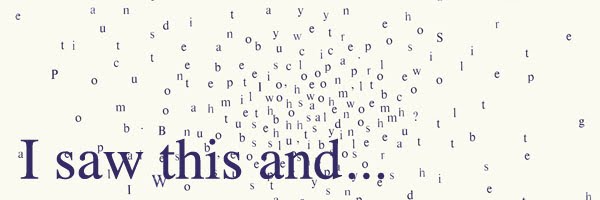
An installation I saw in London while I was down there by Julius Popp, called bit.fall. The water acted as a medium for the typography, and showed live news stories from the Times online. Really interesting a affective, however in some places its quite difficult to read. x
Saturday, 27 November 2010
Mapping Music
This project is finally done. Hurrah!
I really enjoyed it actually. I took a different approach to my research and idea generation stage and it seemed to have paid off. I didn't find I got stuck in a rut at any point with any of my ideas. If anything I had more than enough, and i would have loved to have taken more further. Maybe that will be a job over Christmas....


I chose the song Koral by the band oval- itunes it. It's very slow, repetitive and peaceful. In my final 'map' I tried to focus on the repetitive and simple nature of the song by making a never ending book. The book was comprised of 102 pages as there were 102 seconds in the song. I cut holes in each page to represent a note and how long it lasted for. I also made an A1 print showing each circle and a stop frame animation which would show how the holes and pages related to the song.
I'm not happy with the quality of the photos taken of the book- that shall be a job for xmas! Hope you enjoy x

Friday, 26 November 2010
When Facebook becomes real.
As I'm a lover of all things book, this really took my fancy...
Pretty self explanatory, but I find the cross-over between digital and print really interesting. I think by printing something and making it into a publication, you really appreciate how much information the internet can store. via Creative Review x
Sunday, 7 November 2010
Pentragram: What type are you?


What a fun way to spend five minutes on a cold sunday afternoon! What type are you is not just an interesting experiment, but it is extremely well designed. From the typefaces chosen, the video commentary to the data collection it is great from start to finish. I am gladly Archer Hairline, a beautiful typeface that I had not previously seen before. It has both form and elegance. Hopefully my type may play a role in my new project as I am exploring my song in a very personal way, and using the type that matches me may prove useful. I suggest you give it a go your self! x
Tuesday, 26 October 2010

Monday, 25 October 2010
The story of the DIY music video.
Whist beavering away last week trying to finish my last project I was listening to some late night radio on on Radio 1. It was one of the 'stories' features and this week they were looking at the phenomenon of music videos, as well as videos created by fans. They had many interviews with creators or directors of some of the videos featured. I think it offered a great insight into the world of music videos as it is something that I don't really know anything about. It also may proove usefull for the new my brief which is based on mapping music. I found this broadcast really inspiring as it made me really want to make my own fan video for some of my favorite artists/bands! Below are some of my favorite videos that were featured. I think you can still catch the 'story' on www.bbc.co.uk/radio1/stories. Enjoy!!! x
Daft Hands- Austin Hall
Oxford Comma- Vampire Weekend
Gabe Askew fan video for Grizzly Bear- Two Weeks
Two Weeks - Grizzly Bear from Gabe Askew on Vimeo.
Radiohead- Jigsaw Falling Into Place
Project 2.1- RESTRCTIONS
First project back was a hard one. The project was called restrictions so, we had many placed on us. We only had a limited selection of words to choose from, we were only allowed to create four double page spreads or an animation and we could only used helvetica and two colours. From the list of words I chose 'belly flop' as mine. The brief asked us to 'explore the word in a new and interesting way.' With belly flop I decided focus on how the word is said with the mouth and how 'flop' is a very onomatopoeic word. The four spreads below show my final outcomes, the text on them all relate to onomatopoeia and the large amount of text is the lyrics to the 'Trolley song' by Judy Garland.


Tuesday, 19 October 2010
Lovely Animation
Haven't posted in ages, had way too much work with my first second year project. I'll fill you in on it later this week when I have time to stop and think!
In the meantime, thought I would just post this up this great animation by Ed Barratt called Man Up. I think I like it so much because of it's effortless simplicity- an aesthetic I'm beginning to realize I strive for in my own work. x
Man Up from Ed Barrett on Vimeo.
Thursday, 7 October 2010
Invite

For my housemate's 21st birthday we had a house party at our new uni home. I, as the graphic design student of the house was roped into making a flyer/invite to post round to the neighbors on our road. I went for something simple, eye catching and only black and white to save on ink-we are poor, poor students! I thought I would try using just helvetica as that is one of the restrictions we have been set in our new uni project (more of that to follow). I think it turned out well, lots of people came and the birthday girl was happy! x
Final: summer project


Final outcome for my summer project brief A is not for apple and z is not for zebra. I decided to go with the 2d design with different coloured blocks in the the end as, after much deliberation it thought it worked best. Photographing the block letters turned out to be a complete pain in the arse; messing around with different background colours and angles of shot, but eventually I decided to have them on a plain white background, but the photography still isn't great.
Crit turned out to be pretty disappointing, it ended up taking a long time to get around everyone and when it was my turn I don't think I got that much feed back. I know I want to add to my project and present it in a different way for final hand in, as the way I initially presented it I don't think did it justice. x
Monday, 13 September 2010
SUMMER (project)
I'll start by saying that a brief being called summer project is very misleading, and pretty much depressing. Summer is meant to mean no work, parks, BBQ's, holidays, sunbathing, reading, time wasting, seeing friends, sleeping and generally not doing much. But no! With a summer project this all goes out of the window, well maybe for only the last few weeks when you feel the terror of a deadline a' looming.
Anyway I have been chugging along with my project for about the last four weeks, doing tiny bit everyday and not really getting anywhere fast. The brief is to create an alphabet which shows a response to one or many of our summer experiences. It's pretty open ended, we can create a new typeface or use an unusual method of displaying the alphabet etc. for our final outcome. I decided to base my project on Playmobil, after spending the best part of a week sorting a mountain of it out. After much faffing, I decided to make an interactive alphabet where using a few things you can make many, such as with Playmobil. I decided to make a set of 14 blocks out of wood that could be put together to form the 26 letters of the alphabet, below are the photos;


To make them I used balsa wood which is a very light, easy to cut wood. ( I am yet to drill holes which will allow them to attach together) In addition to this I am also trying to come up with a digital version of this new typeface which can be used as a more practical readable version of the wooden 3D typeface. I am currently really struggling with this aspect of my project. I have tried many different ways of displaying the typeface but none seem to be quite right, well to me anyway. I am tempted to leave my project at just the wooden type but I think it needs something else, something to make the process of arranging the wooden blocks relevant. Below are some sample of the digital typeface;


Hopefully more photos to follow of the final thing! x
Tuesday, 17 August 2010
Fiona Banner


Stumbled across the artist Fiona Banner through It's Nice That blog, whilst doing some research for my alphabet summer project. Even though she's at artist she does some interesting things with type. She seems to turn the conventions of type on it's head, making you question why you had never thought about it that way. She also seems to focus a lot on war imagery and machinery; using drawings of various planes, tanks etc. to create her 'The Bastard Word' alphabet.
Some of my favourites are 'Black Alphabet', 'Portrait of an Alphabet' and 'Full Stops'. (All shown above) Hopefully her work will prove as some useful inspiration! x
http://www.fionabanner.com/index.htm
www.itsnicethat.com
*loser alert* MT masking tape

Japanese masking tape, sad I know, but how can it bad sad when it looks so good? Lot's of lovely colours and patterns which can be used for a variety of different things. I'm planning on using mine for sticking up pictures in my new house at uni! I'm lusting after the tartan and black and white sets (not shown) x
http://www.masking-tape.jp/
Wednesday, 11 August 2010
Cote D'Azur France


Just some pictures I took on holiday on some of the more interesting and less touristy aspects of where we visited! However, I sadly completely forgot to take any on my Diana Mini which was ready and loaded up with a black and white film, gutted. Hope you enjoy! x
Apostrophe design

I then coloured in the scarf using the Apostrophe pink colour. Below is how far I got. After the long long process of individually filling in each 'stitch' I decided to print and make a cup mock up to see how it was working. But from doing this I found that it really wasn't an effective design. I like the illustration as a 2-D image, but when applied to the cup format it no longer really ends up looking like scarf. So I have decided not to enter the competition. Im going to put this down as a colossal waste of time, but a lesson none the less!!! x

Tuesday, 20 July 2010
Apostrophe
The small coffee shop chain Apostrophe (mainly based in London) are holding a design competition. The brief is to design a take away coffee cup to be used in the winter season. The winners designs will be used on cups between November until January 10/11, they also get £500 to spend on art supplies and a years free coffee! I think I'll give it a go! x
http://www.apostropheuk.com/
Tuesday, 6 July 2010
Diana Mini
I gave into temptation and bought a diana mini from lomography. I decided it was time i learnt how to take photographs and with the diana being a VERY simple camera, I couldn't go wrong! But I was mistaken. Its not that it's hard, more that i'm very unpracticed when it come to film photography. Ah well, at least most of the shots ca me out in one way or another. Here are some of my favourites x


Subscribe to:
Posts (Atom)