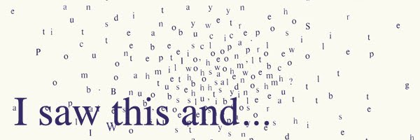
In my initial email to him I used the phrase "no answer is a wrong answer". He seemed to like this phrase so much so that, with my permission, he has used it as his 'message of the week'. Which can be seen here or below. Nice turn up for the books, and a nice man. See some more of Anthony Burrill's work here.
Monday, 30 January 2012
Rather chuffed
Whilst researching my dissertation (handed in today- yay!), I got in contact with a few designers and asked them how they would catagorise what they do. One designer I spoke to was Anthony Burrill. He was very helpful and friendly and his answers I think added an extra element to my essay.
In my initial email to him I used the phrase "no answer is a wrong answer". He seemed to like this phrase so much so that, with my permission, he has used it as his 'message of the week'. Which can be seen here or below. Nice turn up for the books, and a nice man. See some more of Anthony Burrill's work here.
In my initial email to him I used the phrase "no answer is a wrong answer". He seemed to like this phrase so much so that, with my permission, he has used it as his 'message of the week'. Which can be seen here or below. Nice turn up for the books, and a nice man. See some more of Anthony Burrill's work here.
Thursday, 26 January 2012
Edible Colour
This was a competition brief set by YCN. The brief was to create an integrated marketing campaign for Fedrigoni papers new colour selection tool.
From reading the brief the main thing that struck me was quote 'the art and science of paper'. I decided to play with this idea and really investigate how colour is really made. Through experimentation I found that dyes can be made using a variety of natural products.
From reading the brief the main thing that struck me was quote 'the art and science of paper'. I decided to play with this idea and really investigate how colour is really made. Through experimentation I found that dyes can be made using a variety of natural products.
Edible colour is a tounge a cheek take on how Fedrigoni colour their papers. The produce used reflects Fedrigoni's Italian history as well as traditional cookbook design. The three ranges of Edible Colour reflects the different colour ranges Fedrigoni has on offer. To create an integrated marketing campaign I produced a cookbook, poster design and recipe cards that would be sent to designers.
BANG!
Now assessment is over and done with it's time to show my efforts to the world.
For the first brief of this term I created a narrative around the theme of fringes (bangs). The illustrations and the colour scheme provide a tension to what is already a dark story. I wanted the illustrations to be the main focus of the graphic novel, but I also wanted the type to compliment the images.
During this project I also created a fringe typeface to try and create the movement of hair with in rigid letterforms.
Wednesday, 4 January 2012
Jesus' Crib
For a fundraising venture I took part in a pop up Christmas shop organised by friends on the graphic design course, which was held in university to raise money for our degree show. I designed and printed some tea towels to be used all year round and I think they went down a treat! I think the next stop is to print some of the designs onto paper so I can experiment more with colour variations and to show the detail of the ornate woodblock type I used for the design.
Subscribe to:
Comments (Atom)


