Saturday, 19 May 2012
Recycle
I made this little booklet for a project I'd been working on. However I haven't ended up using. It seems a waste as I'm rather fond of it, I may put some practical paper inside and use it as a note book instead!
Monday, 23 April 2012
Monday, 16 April 2012
Laddie and Lassie
This is the most recent old postcard that I have added to my collection and it is by far my favourite. It was sent in 1950 from Ontario, Canada to a small town near where I live. These dogs are super cute, and the woman's jumper is beyond amazing!
Sunday, 15 April 2012
Dogs
This was my Grandma's silk scarf which got passed on to me quite a few years ago. Its sat in a box ever since, being treasured but not used. I really love it, the colours and contrast are brilliant and it has a real sixties feel. I wish I could think of a way to display it to its best!
Friday, 13 April 2012
Fashion Show Invites
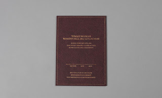
Came across a massive of selection of invites to the major fashion shows for this years fashion weeks. They all have such an expensive finish to them and it is clear to see that a lot of time has been taken over their design which makes them really exciting to look at. Found on Wallpaper Magazines website.
Friday, 17 February 2012
Max Huber
Just discovered the work of Max Huber today and I am totally in love. His work is everything I love in design; colour, cleaver use of images, typography and playful uses of text with image. Can not belive it has taken me this long. Max Huber where have you been all my life?
Thursday, 9 February 2012
NB Studio/Jean Jullien
'This Year' is a rather beautiful publication from NB studio. An annual event, 2011's This Year looks towards the future, and focusses on the prediction that the world will end in 2012. The illustrations are by Jean Jullien, one of my favourite illustrators at the moment. The use of bold colours, and structured typography with playful illustrations is really effective. Just which I could get my hands on one in real life. Found on the YCN blog.
Sunday, 5 February 2012
Lucile's Kitchen
Following on the theme of painterly illustrations and designs is the work by Lucile of Lucile's kitchen. A really wonderful blog full of painted food of all varieties, all from the wonderful city of Paris. It really makes me want to visit again in order to hunt out all its hidden jems. Her use of colour and brush strokes is really brilliant. I love the images where there is just a hint of what the vegetable's shape is; I think this simplicity is very effective.
Saturday, 4 February 2012
Lorna Lamm
Illustrations by designer Lorna Lamm for Pirelli and La Rinascente between the 1950's and 1960's. I have recently been looking a lot at painted illustrations and design work. The mediums of watercolour and gauche painting both type and image are aesthetics that really attract me. The bright colours and epressive nature of painting with a brush, using bold colours is something which I would like to experiment with in upcoming projects.
Monday, 30 January 2012
Rather chuffed
Whilst researching my dissertation (handed in today- yay!), I got in contact with a few designers and asked them how they would catagorise what they do. One designer I spoke to was Anthony Burrill. He was very helpful and friendly and his answers I think added an extra element to my essay.
In my initial email to him I used the phrase "no answer is a wrong answer". He seemed to like this phrase so much so that, with my permission, he has used it as his 'message of the week'. Which can be seen here or below. Nice turn up for the books, and a nice man. See some more of Anthony Burrill's work here.
In my initial email to him I used the phrase "no answer is a wrong answer". He seemed to like this phrase so much so that, with my permission, he has used it as his 'message of the week'. Which can be seen here or below. Nice turn up for the books, and a nice man. See some more of Anthony Burrill's work here.
Thursday, 26 January 2012
Edible Colour
This was a competition brief set by YCN. The brief was to create an integrated marketing campaign for Fedrigoni papers new colour selection tool.
From reading the brief the main thing that struck me was quote 'the art and science of paper'. I decided to play with this idea and really investigate how colour is really made. Through experimentation I found that dyes can be made using a variety of natural products.
From reading the brief the main thing that struck me was quote 'the art and science of paper'. I decided to play with this idea and really investigate how colour is really made. Through experimentation I found that dyes can be made using a variety of natural products.
Edible colour is a tounge a cheek take on how Fedrigoni colour their papers. The produce used reflects Fedrigoni's Italian history as well as traditional cookbook design. The three ranges of Edible Colour reflects the different colour ranges Fedrigoni has on offer. To create an integrated marketing campaign I produced a cookbook, poster design and recipe cards that would be sent to designers.
BANG!
Now assessment is over and done with it's time to show my efforts to the world.
For the first brief of this term I created a narrative around the theme of fringes (bangs). The illustrations and the colour scheme provide a tension to what is already a dark story. I wanted the illustrations to be the main focus of the graphic novel, but I also wanted the type to compliment the images.
During this project I also created a fringe typeface to try and create the movement of hair with in rigid letterforms.
Wednesday, 4 January 2012
Jesus' Crib
For a fundraising venture I took part in a pop up Christmas shop organised by friends on the graphic design course, which was held in university to raise money for our degree show. I designed and printed some tea towels to be used all year round and I think they went down a treat! I think the next stop is to print some of the designs onto paper so I can experiment more with colour variations and to show the detail of the ornate woodblock type I used for the design.
Subscribe to:
Comments (Atom)


