Tuesday, 29 March 2011
Film Archive
For the Sam Meech workshop 'Ready, steady archive', I've been watching the videos that we were supplied with. Was really taken with these two title screens from a families how movies. The type seems so lovingly made you can seen the time that has gone into not only the type but the film itself. I like to imagine it was the Dad who was in change of the camera and that he fancied himself as a bit ammature director. You can really see it in some of the more 'arty' shots he has taken. I am fully looking forward to where this project will take me.
Saturday, 26 March 2011
Back to basics
In an attempt to get some fresh and ideas for this book cover project, I've decided to delve into the past. And this afternoon was devoted to and ideas hunt. I hope by having a look at how the masters did it may give me a much needed push in the right direction.
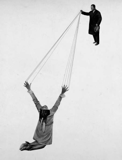
Absolutely loving the photo montages of Marianne Brandt, I picked up a postcard with her design on at the Bauhaus Archiv when in Berlin and since have research more into her work. Beautiful arrangements and real skill at playing with the space on a page.
Absolutely loving the photo montages of Marianne Brandt, I picked up a postcard with her design on at the Bauhaus Archiv when in Berlin and since have research more into her work. Beautiful arrangements and real skill at playing with the space on a page.
Monday, 21 March 2011
Carl Sagan
What an astonishing thing a book is. It's a flat object made from a tree with flexible parts on which are imprinted lots of funny dark squiggles. But one glance at it and you're inside the mind of another person, maybe somebody dead for thousands of years.
A great quote for Carl Sagan- an astrophysicist that I am research for a new project.
Sunday, 20 March 2011
Pick Me Up
I ventured home this weekend not just to visit family but to go to the Pick Me Up graphics fair/ exhibition being held at Somerset house. Prior to going I had read a lot about the 2010 one, so I had high expectations for this years! And it did live up to my expectations. It was truly amazing. I think i could have spent pretty much all day there, not just looking at all the lovely things on offer, but watching artists and designers in action. Anthony Burrill and print club london had moved their studios there so you could ask the artists questions and see them in action. There were also other collectives housed in their own small rooms that became their own little worlds, and zine swap on in the Make It Up area.
There was art on sale from a specially selected 24 'up and coming graphic artists'. I purchased a rather lovely geometric print from Kate Moross! Also bought two lovely postcards from the Nobrow stall. (see them below)
Both the identity and the signage for the exhibition were really good as well and it was nice to see after my art gallery branding project. It injected the feeling of fun with the use of bright colours, geometric shapes, and pin board display panels.
Altogether a lovely day out, and some well needed me time! Felt nice to be back in London and walking around all my favourite places. x
Monday, 14 March 2011
Traveling art gallery branding
This brief was set by branding agency The Partners, and was one of the D&AD competition brief's this year. We were asked to brand a touring art gallery that was to show in hospitals alone. We had to think of unusual ways of promoting a brand that wasn't just a logo and typeface.
At the moment I am only really happy with the logo- so a lot more work will be going into this project!
Sunday, 13 March 2011
Books, books, books.
We have a new brief. It's to design covers for a set of books. I'm researching at the moment but, I just want to read them all....
Beautiful.
Beautiful.
Thursday, 3 March 2011
DIANA MINI
Some more of my favourite snaps from my Diana Mini. Mostly taken on my recent trip to Berlin but there are few from my birthday in Brighton. I think I prefer the colour images. Probably because the colours just seem a lot more vivid and exciting, also, the a lot of the black and white images turned out grainy.
For http://ali-bitsnblogs.blogspot.com/
For http://ali-bitsnblogs.blogspot.com/
Not quite good enough.
Not quite good enough seems to be the motto of my life at the moment. Well, maybe not my life, but certainly this week. It feels like I've been facing a lot of setbacks, and it makes me wonder why do I try so hard? But I suppose I should keep trying and maybe eventually my effort will pay off. At the moment it's just quite disheartening.
Above is a poster I designed re-naming Ian Anderson in an attempt to get onto his workshop. However, it was just not quite good enough. x
Above is a poster I designed re-naming Ian Anderson in an attempt to get onto his workshop. However, it was just not quite good enough. x
Subscribe to:
Comments (Atom)


