Another little something from French Connection. It's a really nicely designed look book for the spring/summer season. I really like the use of the muted colour palette, it seems to draw your eye more to the colourful clothing. I also think that the typography is really interesting, it looks as if it's poking fun at fashion photography in general, yet it does make you look at the image its describing. Not sure who its been designed by, but nice all the same! x
Sent using BlackBerry® from Orange
Monday, 24 May 2010
Screenprint present
Just some photos of the screen print I'm doing for my little brothers birthday. Its in an Andy Warhole style and its a picture of my brother. Not really my usuall style, but my brother said he liked Andy Warhole so that's what he got! He is only 10 x
Sent using BlackBerry® from Orange
Sent using BlackBerry® from Orange
Sunday, 23 May 2010
French Connection window displays
So I saw these the other day whilst shopping in Manchester. They have used holograms to show three large images of peoples faces in different emotions. Very nicely done but I bet its pretty pricey! x
Sent using BlackBerry® from Orange
Sent using BlackBerry® from Orange
Thursday, 13 May 2010
Tenderoni
Kele Okereke- bloc party's front man has a new solo single- Tenderoni.
Really like this song, the dance feel teamed with his voice works really well. The video is very good as well. Very simplistic and dark, I especially like the slowed down chalk dust sections.
x
Monday, 3 May 2010
Project 1.6 new words
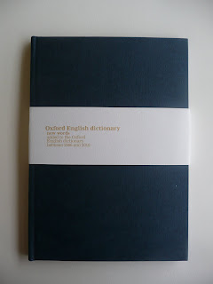
For our last project of first year, we were given a previous Roses competition brief. We were asked to come up with a campaign for the new words that go into the Oxford English Dictionary every year.
So, for my response to the brief I made my own book of poetry. I wrote a poem for a selection of the new words and put them in the book. I tried to give the book a dictionary feel by using a similar font and typesetting the text in a similar way.
I am very happy with the results, and I'm glad the final result looks professional.
x


Sunday, 2 May 2010
Raaaaaandom
Saw this a while ago and thought "oh that's nice" so I saved it and here it is! It's an illustration/screen print by Walzo (I think) based on the lovely city; Manchester.


It probably makes more sense to those if us who live here
x

Emily Forgot


Emily visited uni the other week to give all the Graphics and Illustration students a lecture on her work.
She mainly works as an illustrator but said that she thoroughly enjoys design but doesn't get to do it as much as she would like. I was already familiar with her work before the talk but I found it very interesting the way she talked about how a lot of her commercial work she didn't really like and just did what she was asked.
I found her very down to earth and very honest about the industry!
x
Pick me up
Very jealous I won't be able to go to the pick me up exhibition at Somerset House until May the 3rd. It looks really good if you into anything graphics based, especially print.
Rob Ryan and Print Club have transferred their studios there for the short exhibition so the public can see them at work. I would love to see Rob Ryan at work!
Looks like a great place to visit- if only I was in London!
x


Subscribe to:
Comments (Atom)


