Tuesday 30 November 2010
Watery Type
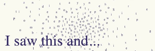
An installation I saw in London while I was down there by Julius Popp, called bit.fall. The water acted as a medium for the typography, and showed live news stories from the Times online. Really interesting a affective, however in some places its quite difficult to read. x
Saturday 27 November 2010
Mapping Music
This project is finally done. Hurrah!
I really enjoyed it actually. I took a different approach to my research and idea generation stage and it seemed to have paid off. I didn't find I got stuck in a rut at any point with any of my ideas. If anything I had more than enough, and i would have loved to have taken more further. Maybe that will be a job over Christmas....


I chose the song Koral by the band oval- itunes it. It's very slow, repetitive and peaceful. In my final 'map' I tried to focus on the repetitive and simple nature of the song by making a never ending book. The book was comprised of 102 pages as there were 102 seconds in the song. I cut holes in each page to represent a note and how long it lasted for. I also made an A1 print showing each circle and a stop frame animation which would show how the holes and pages related to the song.
I'm not happy with the quality of the photos taken of the book- that shall be a job for xmas! Hope you enjoy x

Friday 26 November 2010
When Facebook becomes real.
As I'm a lover of all things book, this really took my fancy...
Pretty self explanatory, but I find the cross-over between digital and print really interesting. I think by printing something and making it into a publication, you really appreciate how much information the internet can store. via Creative Review x
Sunday 7 November 2010
Pentragram: What type are you?


What a fun way to spend five minutes on a cold sunday afternoon! What type are you is not just an interesting experiment, but it is extremely well designed. From the typefaces chosen, the video commentary to the data collection it is great from start to finish. I am gladly Archer Hairline, a beautiful typeface that I had not previously seen before. It has both form and elegance. Hopefully my type may play a role in my new project as I am exploring my song in a very personal way, and using the type that matches me may prove useful. I suggest you give it a go your self! x
Subscribe to:
Posts (Atom)